Blog, Home Design, Interior Design, The Color Code
7 Gentle Colours From Off-White to Light Neutrals
Jun
Choosing the Perfect Shade: 7 Gentle Colours from Off-Whites to Light Neutrals That Work in Every Room
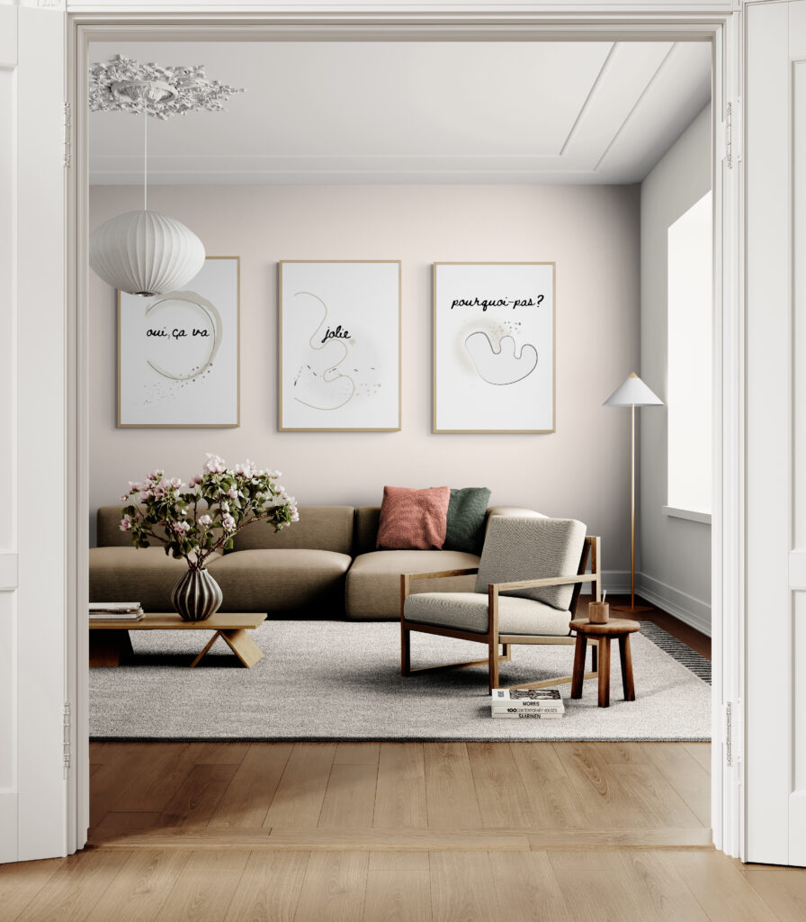
Creating a restful sanctuary in your bedroom or cosy living room starts with choosing the right colour, a shade of off-white or cream that feels warm, soft, indulgent, and relaxing.
Of course, you can apply this to any room in your home. Off-whites are a wonderful neutral base for the entire space, especially when used consistently throughout the space. But to make sure the shade will work for you and won’t irritate you in the long run, it’s worth choosing with care.
That’s where I hope I can help you. Below, I’ll explain the most popular off-white shades, how to tell whether they’re warm or cool, and how to use them in a way that brings lasting balance and softness to your space.
How to Choose from 7 Gentle Colours From Off-White to Light Neutrals to your home
You’re walking down the paint aisle… and you’re faced with dozens of whites. Beige, greige, cream, cotton, cashmere, all staring back at you.
You’re thinking: help! It’s simply too much to take at first.
They all look almost the same, but somehow each one changes the mood of the room entirely.
The key is understanding their undertones:
Warm understones:
Warm whites carry subtle notes of yellow or beige, adding softness and warmth, making them perfect for a restful sanctuary.
Cool undertones:
Cool whites, meanwhile, may have grey, green, or blue notes, adding a somewhat chilly feeling that’s less desirable in a restful space.
The Emotional Appeal of off-white Shade. What You Should Look For
Here’s a helpful way to identify the feeling each shade brings to your sanctuary:
The shades listed here are based on NCS references and tone descriptions. I recommend visiting your local paint supplier and asking for samples closest to the NCS code provided (see guide below).
Always test a sample at home before choosing.
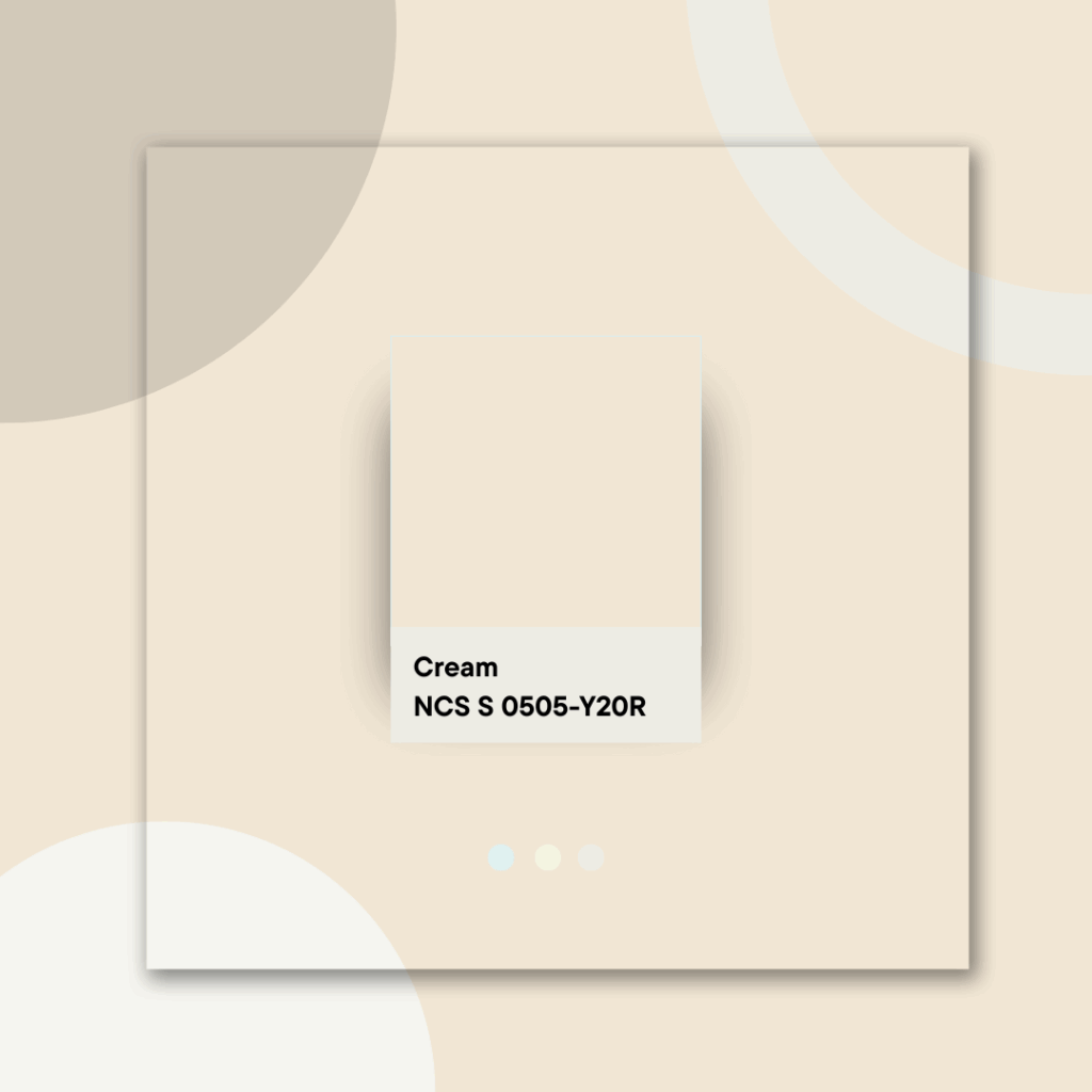
Cream
The Glow
Dreamy, warm, welcoming.
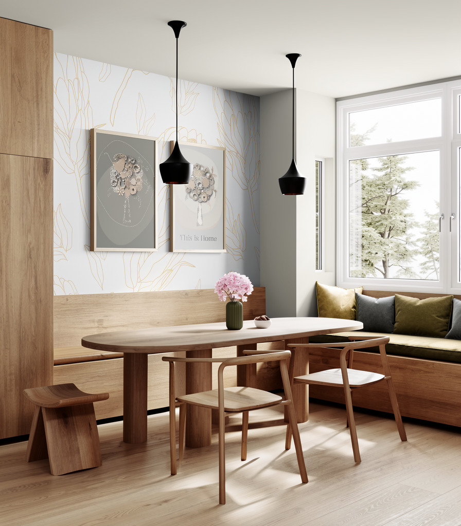
Cream makes a room feel soft, warm, and inviting, not too bright, not too cold.
It gives the space a gentle light that feels calm and comfortable.
With cream on the walls, your family will feel relaxed, safe, and settled, like the room is holding them, not just decorating around them.
This colour feels rich, hotel-like, pure relaxation.
Cream shades across paint brands:
- Dulux Magnolia
- Fleetwood Ivory White
- Benjamin Moore Ivory White (925)
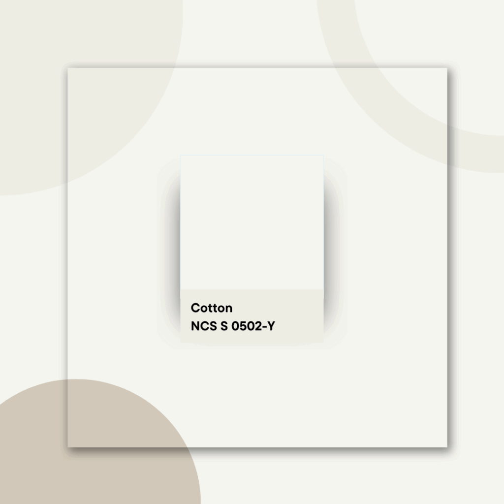
Cotton
The Pure Haven
Clean, pure, a little sweet
Cotton evokes natural softness; it’s the lightest of all the colours I’ve mentioned here.
If you’re looking for a substitute for plain white, this is your ideal choice.
It’s almost invisible as a colour, and that’s a compliment — it creates a clean, calm background that doesn’t compete with anything else. Cotton lets your furniture, fabrics, and textures take centre stage while keeping the room light and restful.
Cotton shades across paint brands :
- Dulux Pure Brilliant White (Soft White)
- Fleetwood White Glove
- Benjamin Moore White Dove (OC-17)
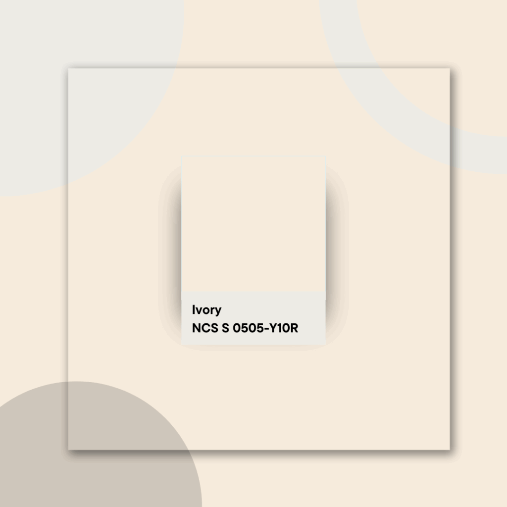
Ivory
Warm and welcoming
Ivory glows faintly yellow, adding warmth and softness. Best for rooms where you want gentle light and a welcoming feel.
Avoid if you’re aiming for a very crisp or cool-toned look
Ivory shades across paint brands:
- Dulux Ivory Lace
- Fleetwood Ivory Wedding
- Benjamin Moore Ivory White (925)
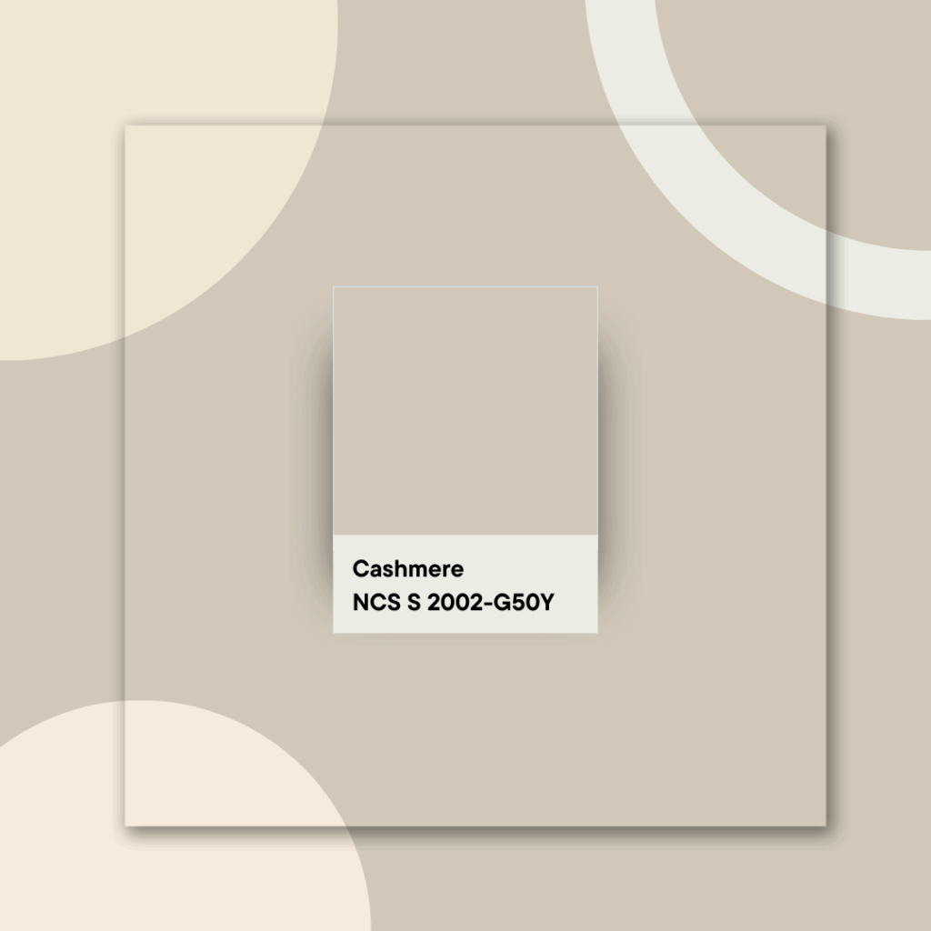
Cashmere
The Cocoon
Soft grey‑beige with a delicate warmth.
Cashmere is one of the most popular shades for kitchens and calm, light-filled walls. Its soft grey-beige warmth makes rooms feel settled, effortless, and easy to live with , modern but never stark
Cashmere feels sophisticated yet comforting.
Cashmere shades across paint brands:
- Dulux Soft Cashmere
- Fleetwood Cashel Gold Light
- Benjamin Moore Edgecomb Gray (HC-173)
Paint shade names are suggestions based on visual similarity. Always test a physical sample or use an NCS code for a more accurate match.

Beige
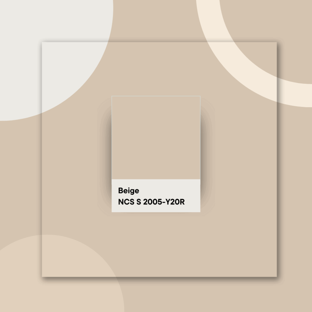
The Embrace
Beige is a warm, calm, and familiar colour.
It makes a room feel peaceful and grounded, like a space where you can truly switch off.
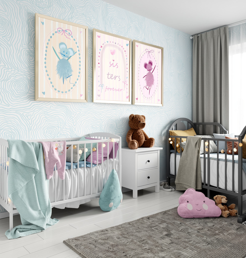
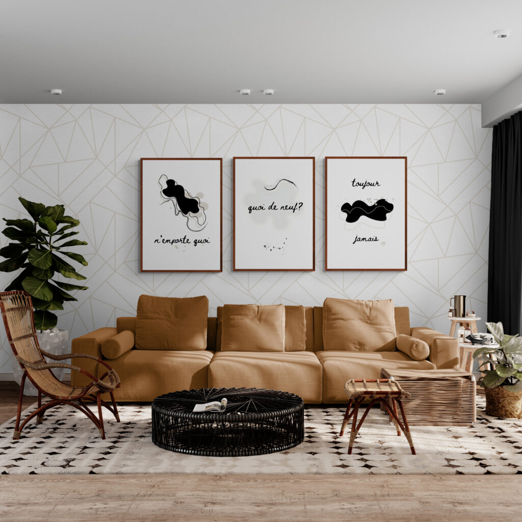
If you want a cosy, comforting atmosphere without going too dark or dramatic, beige is your go-to. It works especially well in bedrooms, nurseries, or any space where you want to feel safe and at ease.
Beige shades across paint brands:
- Dulux Natural Hessian
- Fleetwood Soft Stone
- Benjamin Moore Shaker Beige (HC-45)
Gringe (Greige) (grey + beige)
What is Gringe (Greige)?
Gringe or greige is a colour that falls between grey and beige. It brings together the warmth of beige with the coolness of grey. It’s soft and versatile. Gringe is a great choice when you want a colour that is calm, welcoming and elegant without adding warmth or chill.
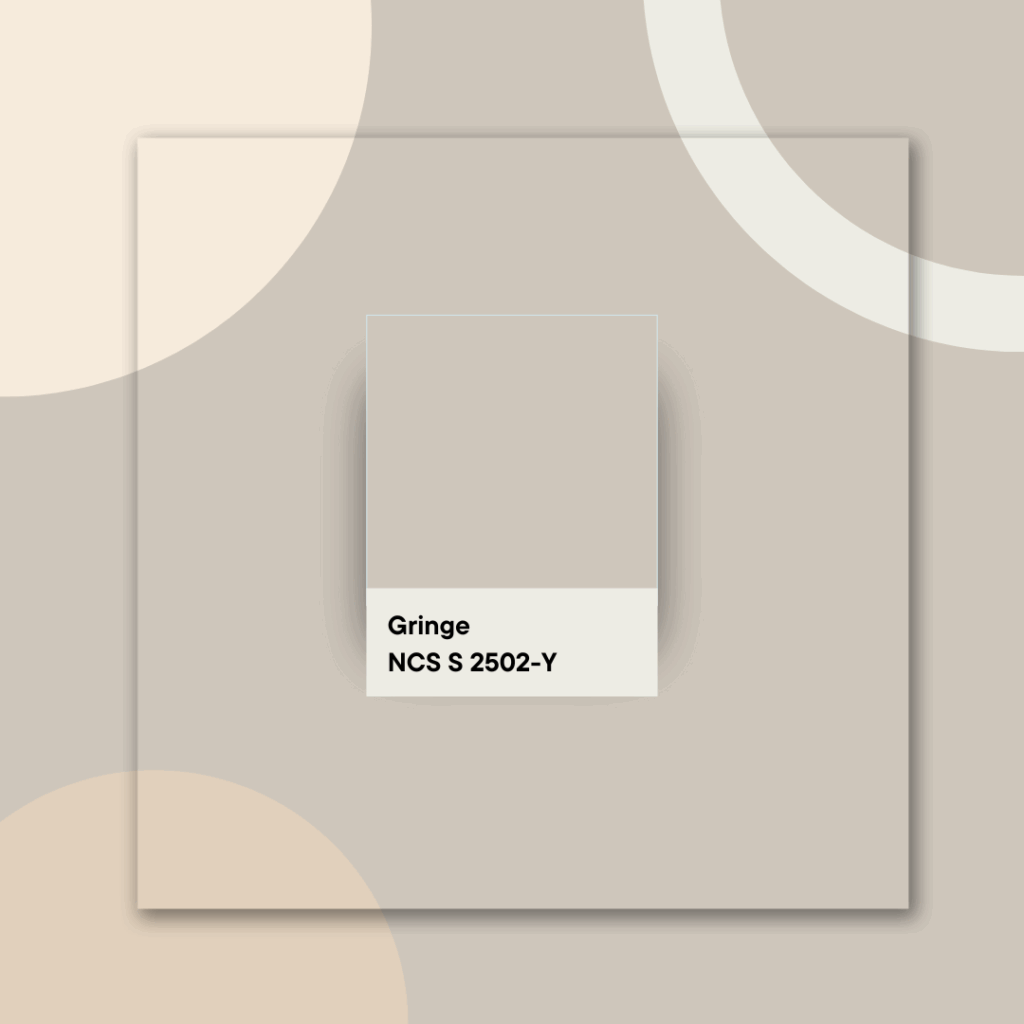
The Sophisticate
Greige is more elegant than beige, less casual, but still very warm.
It’s quiet, versatile, and sophisticated; it brings depth without overwhelming the space.
Perfect if you want a more polished look that still feels soft and comfortable, especially in bedrooms or living areas where you want subtle style without sharp contrasts.
Greige shades across paint brands:
- Dulux Egyptian Cotton
- Fleetwood Porcelain Mood
- Benjamin Moore Revere Pewter (HC-172)
How You Can Choose Your Shade
Consider your light. Is your room north or south-facing? Does it get strong afternoon sunlight or a gentle glow?
Take large samples and view them at different points in the day, in the morning, at sunset, under your reading lamp, until you see which one resonates most with your space.
NCS or Paint Brand Palettes. Making It Precise
If you want more control and confidence, use NCS (Natural Colour System) or colour charts from well-established brands (Farrow & Ball, Little Greene, Dulux, or Benjamin Moore).
This lets you identify exactly the warmth or softness you’re looking for without guessing.
How to Combine Without Clash
When blending whites and off‑whites, keep them within the same temperature range, warm with warm or cool with cool, to avoid creating a disjointed or confusing space.
Consider adding texture with linen pillows, thick throws, or a creamy rug. This maintains depth and softness, making your sanctuary feel rich, restful, and welcoming.
Get the extended version of Off-Whites Colour Guide with additional shdae for you to choose from.
Print it and take with you to the shop. Download for later, browse easily.
Final Thoughts. Your Bedroom as Your Safe Haven
Creating your restful refuge is a process, a blend of careful observation, pure feeling, and understanding colour. The result is a space where you can let down your defences, ease your mind, and sink into pure relaxation — a sanctuary designed just for you.
“Which One Are You?”
If you’re feeling a bit overwhelmed with all the options, here’s a quick way to narrow things down. Think of it like a shortcut to choosing your starting point.
What kind of feeling are you trying to bring into your space?
- If you want: a colour that blends invisibly into the background → Go for Cotton
- If you want: a cosy, warm and safe feeling → Choose Cream or Beige
- If you want: depth but don’t like grey → Try Cashmere
- If you want: a polished, soft-modern look → Pick Greige
Want a printable guide to take to the shop with you for quicker shopping and a less painful process?
Sign up here for the extended Off-Whites Colour Guide – a carefully curated palette of shades that work beautifully in any room.
Gosia